
Sizing
Every length is a fraction of the view’s basis - the smaller side of its content box - so one tree is correct at any size and a resize never costs a round-trip. (For device layout descriptors, see Layout providers.)
Example
Section titled “Example”new UiStack{ Key = "card", Justify = UiComponentJustify.SpaceBetween, Padding = safeArea, Children = [ new UiStack { Key = "header", Direction = UiComponentDirections.Horizontal, Children = [ new UiTextRun { Key = "room", Text = "Office", Size = 0.1, Fill = true }, new UiTextRun { Key = "time", Text = "14:05", Size = 0.1, MainSize = 0.3, Align = UiComponentAlignments.End }, ], }, new UiTextRun { Key = "value", Text = "21.5°", Size = 0.3, Weight = UiComponentTextWeights.Bold }, new UiTextRun { Key = "caption", Text = "Humidity 48 %", Size = UiSize.Capped(0.1, 12) }, ],}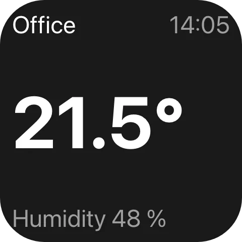
A bare double is a fraction of the basis: Size = 0.3 is a font 0.3 times the basis.
One tree at three sizes
Section titled “One tree at three sizes”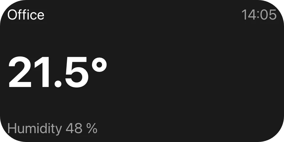
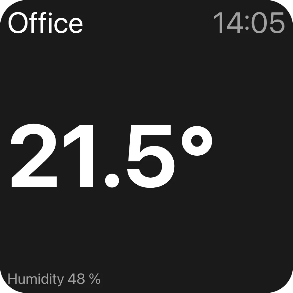
The same tree at 2x1 and 2x2. A 2x1 tile has the same basis as a 1x1 one, so only the filling header grows. At 2x2 the basis doubles and so does every length - except the caption, whose cap stops it at 12 reference units.
Capping a length
Section titled “Capping a length”Size = UiSize.FromBasis(0.144, 1.2) // min(0.144 x basis, 1.2 x the stack's cross extent)Size = UiSize.Capped(0.11, 13) // min(0.11 x basis, 13 reference units)FromBasis(basis, maxOfCross) stops a length outgrowing the row or column it sits in, such as a forecast
row’s text once many rows share the height. Capped(basis, extent) stops it growing past a fixed size, so
a caption reads the same on a one-cell widget and a nine-cell one. A length carrying both caps resolves to
the smallest of the three.
The cap unit is UiLength.Cell (120): one deck cell in the reference space a deck widget is laid out in.
It is a definition, not a measurement - a reader lays the widget out in that space and scales the result to
the real cell - so it only has to agree across the wire, never with any device’s pixels.
Sharing a row: Fill and MainSize
Section titled “Sharing a row: Fill and MainSize”new UiTextRun { Key = "name", Text = "Living room", Size = 0.14, Fill = true },new UiTextRun { Key = "temp", Text = "21°", Size = 0.14, MainSize = 0.3, Align = UiComponentAlignments.End },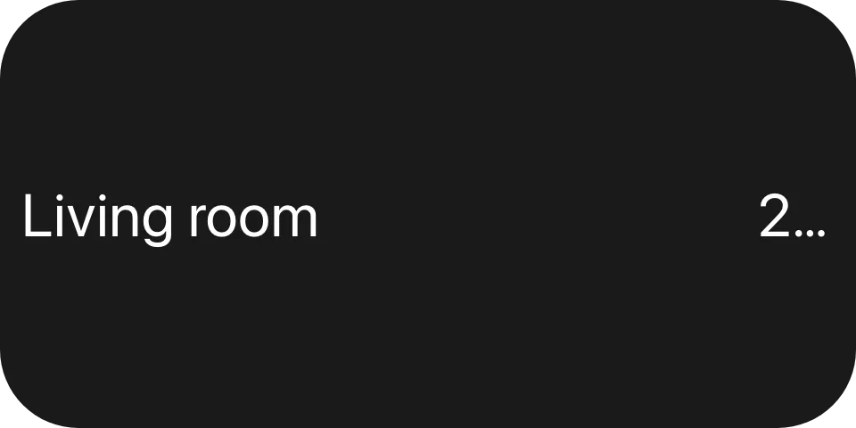
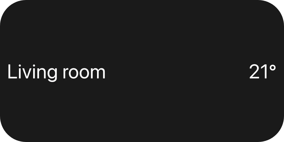
MainSize is a child’s extent along its parent’s main axis; Fill takes whatever the siblings leave,
split evenly between filling children, and a child with a MainSize ignores Fill. A child with neither
is measured without a font: an image is its Size, a text is its line height across the stack and
nothing along it. So give every text in a row its own MainSize whenever a sibling fills - top
picture without it, bottom with it.
Size (the font) and MainSize (the slot) are different properties; set both on a text in a row.
Gap and padding
Section titled “Gap and padding”new UiStack { Key = "card", Padding = UiSize.FromBasis(0.06), Gap = UiSize.FromBasis(0.03), Children = [title, body] }Padding insets every edge, Gap separates neighbours. Both are lengths like any other; absent means none.
Frames and wrapping
Section titled “Frames and wrapping”new UiModifier{ Key = "art", Fill = true, Frame = new UiFrame { MaxWidth = UiLength.OfBasis(0.6), AspectRatio = 1 }, Child = new UiImage { Key = "cover", Source = cover },}A modifier with a Frame fixes or clamps its own box and centres it in the
space it is given; Padding on a modifier insets its one child. Wrapping moves the child’s slot to the
wrapper: MainSize, Fill, ColumnSpan and RowSpan go on the UiModifier, and a wrapped child that
sets them is rejected when the view is built. A filling wrapper’s maximum clamps only its own size - the
space it gives up is not redistributed to its siblings.
Reference
Section titled “Reference”| Length | Resolves to |
|---|---|
0.2 / UiSize.FromBasis(0.2) / UiLength.OfBasis(0.2) |
0.2 x basis |
UiSize.FromBasis(0.2, 0.5) |
min(0.2 x basis, 0.5 x containing stack's cross extent) |
UiSize.Capped(0.2, 20) |
min(0.2 x basis, 20 reference units) - MaxOfCell = 20 / UiLength.Cell |
UiSize.From(() => ...) / UiSize.Optional(...) |
computed each evaluation / may be absent |
| Property | On | Meaning |
|---|---|---|
Size |
text, image, time and progress text | Font size, or an image’s extent. MinSize is the floor a text may shrink to before it ellipsizes. |
MainSize |
every element | Extent along the parent stack’s main axis. Wins over Fill. |
Fill |
every element | Takes an even share of the parent’s leftover main-axis space. |
Gap, Padding |
stack, button, list | Space between children, and inside every edge. |
Padding, Frame |
modifier | Inset of the one child, and the wrapper’s own fixed or clamped box. |
Thickness |
slider, range and progress bar | Extent on the cross axis. |
Reader rules:
- A reader that cannot determine the containing stack’s cross extent ignores
MaxOfCrossrather than guessing. MaxOfCellonly means something where a deck cell grid exists. A reader laying a view out on anything else - a folder view, a browser window, a dialog - ignores it.MainSizeandFillmean nothing on a layer’s children: each gets the whole box.
See also
Section titled “See also”- Stack and layer
- Text -
Digits,MinSize, wrapping - Chart - normalised points and
PlotTop - Theming