Shape
A filled and stroked outline - a status dot, a badge behind a number, a divider, a simple glyph of your own - drawn without registering any artwork.
ui.shape
Example
Section titled “Example”new UiShape{ Key = "status", Shape = UiComponentShapes.Circle, Color = UiValue.From(() => state.Value.Online ? "#34c759" : "#ff3b30"), StrokeColor = "#ffffff", StrokeWidth = 0.02, MainSize = 0.3,}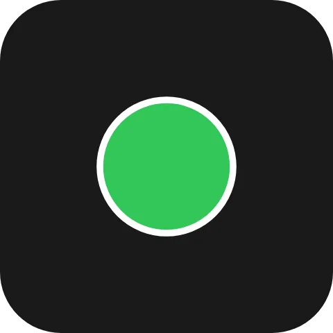
A status dot: switching its colour is a set-properties patch carrying color alone.
Rounded rectangles and capsules
Section titled “Rounded rectangles and capsules”new UiShape { Key = "badge", Shape = UiComponentShapes.RoundedRectangle, CornerRadius = 0.06, Color = "#2b6cee" }new UiShape { Key = "pill", Shape = UiComponentShapes.Capsule, Color = "#2b6cee" }CornerRadius is clamped to half the box’s smaller side, so a very large radius on a rounded rectangle
gives a capsule. A capsule always takes that half side and ignores CornerRadius.
new UiShape{ Key = "play", Shape = UiComponentShapes.Path, Path = "M0.3 0.2 L0.8 0.5 L0.3 0.8 Z", Color = "#ffffff",}
The coordinates are in a unit box: 0..1 spans the element’s own width and height, so the path stretches
with the box while the stroke keeps its width. Only the absolute commands M L H V C Q A Z are accepted,
with SVG 1.1’s number syntax and implicit repetition. A path with anything else, including relative
(lower-case) commands, draws nothing.
Properties
Section titled “Properties”| Property | Values | Default (absent) | Meaning |
|---|---|---|---|
Shape (shape) |
UiComponentShapes.Rectangle, .RoundedRectangle, .Circle, .Capsule, .Path (rectangle, rounded-rectangle, circle, capsule, path) |
rectangle |
The outline. |
CornerRadius (cornerRadius) |
length | Square corners | The corner radius of a rounded-rectangle. |
Color (color) |
#rrggbb |
No fill | The fill. |
StrokeColor (strokeColor) |
#rrggbb |
No stroke | The outline colour. |
StrokeWidth (strokeWidth) |
length | No stroke | The outline width. |
Path (path) |
restricted SVG path data | Draws nothing for path |
The outline of a path shape, in the unit box. |
MainSize (mainSize), Fill (fill) |
- | - | Shared with every leaf - see Sizing. |
The colours are literal colours, not theme roles - see Colours and text.
Events
Section titled “Events”None. ui.shape is never interactive; put it inside a button to press it.
Children
Section titled “Children”None. ui.shape is a leaf.
Layout
Section titled “Layout”A shape has no content extent: on its parent’s main axis it takes MainSize or Fill, and without either
it is 0 long. On the cross axis it follows the parent’s alignment. See Sizing.
Reader behaviour
Section titled “Reader behaviour”The geometry is normative; see the UiShape
remarks.
rectanglefills the box;rounded-rectanglefills it with corners ofcornerRadiusclamped to half the smaller side;circleis inscribed in the smaller side and centred;capsulefills the box with corners of half the smaller side.- An absent
colorpaints no fill; an absentstrokeColororstrokeWidthpaints no stroke. The stroke is centred on the outline and never scaled with a path’s box. - A
pathis validated before it is drawn. Anything outside the absolute commandsM L H V C Q A Z, SVG numbers, whitespace and commas, or data not starting withM, draws nothing. - Reject a command whose arguments are not a whole multiple of its arity (two for
M L, one forH V, six forC, four forQ, seven forA, none forZ); such path data draws nothing. - A
shapevalue the reader does not know draws nothing. A new value raises this type’s component version, so a producer using one setsRequiredComponentVersionand a fallback. - A reader that does not know
ui.shapedraws the node’sfallback. Leave it out when the shape is decoration; where it carries meaning, aui.stackwith the samebackgroundis the closest match:
{ "type": "ui.shape", "properties": { "shape": "rounded-rectangle", "cornerRadius": { "basis": 0.06 }, "color": "#2b6cee" }, "fallback": { "type": "ui.stack", "properties": { "background": "#2b6cee" } }}See also
Section titled “See also”- Stack and layer -
background - Icon
- Image
- Sizing