
Grid
Lays its children out in equal columns and rows - a keypad, a set of stats, a dashboard with one wide cell - without nesting stacks.
ui.grid
Example
Section titled “Example”new UiGrid{ Key = "stats", Columns = 2, Gap = 0.04, Padding = 0.06, Children = [ new UiStack { Key = "cpu", Background = "#1c2430", ColumnSpan = 2, Children = [cpuChart] }, new UiTextRun { Key = "ram", Text = UiText.From(() => $"{ram.Value:0} %") }, new UiTextRun { Key = "gpu", Text = UiText.From(() => $"{gpu.Value:0} %") }, ], Fallback = new UiStack { Key = "statsFallback", Children = [cpuRow, ramAndGpuRow] },}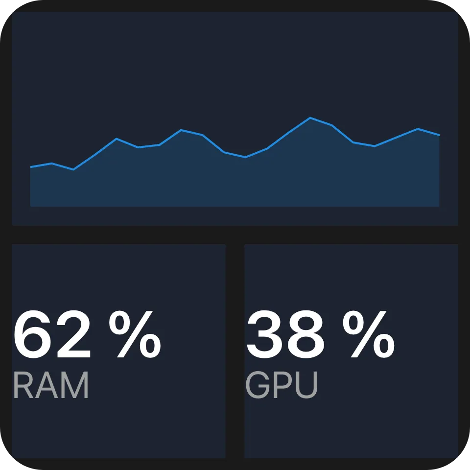
A wide chart across the top and two readings beneath it.
Placement
Section titled “Placement”Children are placed in declaration order. Each takes the first position, scanning row by row from the top
left, where its whole ColumnSpan by RowSpan block is free:
Columns = 3; children A (ColumnSpan 2), B (RowSpan 2), C, D
  +-----+-----+-----+  |  A        |  B  |  +-----+-----+     +  |  C  |  D  |     |  +-----+-----+-----+
A later small child can fill a hole an earlier large one left, so the order on screen can differ from the order of the children.
Spans and rows
Section titled “Spans and rows”ColumnSpan and RowSpan sit on every element and mean something only under a grid; any other parent
ignores them. A span below 1 counts as 1, and a column span wider than the grid is clamped to Columns.
Leave Rows absent and the grid has as many rows as placement needs. Set it and a child that does not fit
in those rows is not drawn.
Properties
Section titled “Properties”| Property | Values | Default (absent) | Meaning |
|---|---|---|---|
Columns (columns) |
int |
1 |
The column count; below 1 means 1. |
Rows (rows) |
int |
As many as needed | The row count; children that do not fit are not drawn. |
Gap (gap) |
length | No gap | The gap between columns and between rows. |
Padding (padding) |
length | No padding | Inner padding on every edge. |
MainSize (mainSize), Fill (fill), Answer (answer) |
- | - | Shared with every container - see Stack and layer. |
On a grid’s children:
| Property | Values | Default (absent) | Meaning |
|---|---|---|---|
ColumnSpan (columnSpan) |
int |
1 |
How many columns the child covers; clamped to Columns. |
RowSpan (rowSpan) |
int |
1 |
How many rows the child covers. |
Events
Section titled “Events”None of its own.
Children
Section titled “Children”Any element, any number.
Layout
Section titled “Layout”The content box minus padding is divided into equal column and row tracks separated by gap, and each child
is drawn across its block. A child’s mainSize and fill mean nothing here, because the grid decides the
block. Lengths inside a child keep resolving against the widget basis, not the cell, so text is the same
size in a grid as anywhere else. On its own parent’s main axis a grid has no content extent: give it
MainSize or Fill. See Sizing.
Reader behaviour
Section titled “Reader behaviour”- Treat an absent or below-
1columns,columnSpanorrowSpanas1; clampcolumnSpantocolumns. - Place children with the dense row-major rule above; with
rowspresent, skip a child whose block does not fit and keep placing the ones after it. - Draw each child across its block, ignoring its
mainSizeandfill; keep the widget basis unchanged. - Hold
columns,rows,columnSpanandrowSpanto at most 64. - Where the parent leaves the grid’s height open - inside a vertical list - make every row as tall as a column is wide, and the grid as tall as its rows need.
- A reader that does not know
ui.griddraws the node’sfallback, typically nestedui.stackrows:
{ "type": "ui.grid", "properties": { "columns": 2, "gap": { "basis": 0.04 } }, "children": [ { "type": "ui.text", "properties": { "text": "A" } }, { "type": "ui.text", "properties": { "text": "B" } } ], "fallback": { "type": "ui.stack", "properties": { "direction": "horizontal", "gap": { "basis": 0.04 } }, "children": [ { "type": "ui.text", "properties": { "text": "A", "fill": true } }, { "type": "ui.text", "properties": { "text": "B", "fill": true } } ] }}