Button
A tile the user presses. It lays out its children exactly as ui.stack does, and adds artwork behind
them, a ring around the edge, and the press itself.
ui.button
Example
Section titled “Example”new UiButton{ Key = "mute", Justify = UiComponentJustify.Center, Background = UiValue.From(() => state.Value.Face), Source = UiValue.From(() => state.Value.Icon), Fit = UiComponentImageFits.Cover, Events = [UiEventHandler.On(UiComponentEvents.Press, () => ToggleMute())], Children = [new UiTextRun { Key = "label", Text = UiText.Of("Mute"), Size = 0.14 }],}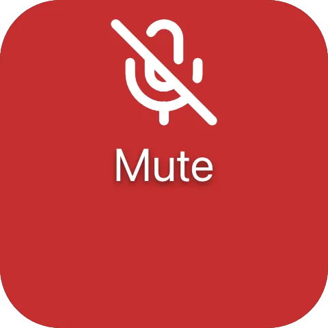
A tile with an icon covering its face and a centred label; a completed press calls ToggleMute.
Handling a press
Section titled “Handling a press”Events =[ UiEventHandler.On(UiComponentEvents.Press, () => Run()), UiEventHandler.On(UiComponentEvents.LongPress, () => OpenOptions()),],Declare only the names you handle. Declaring just Press is how you say the button has no long-press
behaviour. A button with no events is still drawn, but accepts nothing. To show it as unavailable as well,
wrap it in a modifier with Disabled.
Use PressStart and PressEnd to drive something for as long as the finger is down.
Artwork and ring
Section titled “Artwork and ring”Source = UiValue.From(() => state.Value.Artwork),Fit = UiComponentImageFits.Cover,Zoom = 1.2,Brightness = UiValue.From(() => state.Value.Paused ? 0.6 : 1.0),BorderStyle = UiComponentBorderStyles.Breathing,BorderColor = "#ff3b30",
The artwork fills the whole box behind the children, so swapping the face is a property patch rather than
a rebuilt subtree. hue-shift and rgb rings cycle their own colours and ignore BorderColor.
Filling the tile
Section titled “Filling the tile”new UiButton { Key = "backdrop", Fill = true, Corner = UiComponentButtonCorners.Tile, /* ... */ }A button that is the whole tree already takes the tile’s corner. A nested full-bleed button asks for it
with Corner = Tile; otherwise it rounds itself by a share of its own height and cuts an arc across the
tile.
Properties
Section titled “Properties”| Property | Values | Default (absent) | Meaning |
|---|---|---|---|
Direction (direction) |
vertical, horizontal |
vertical |
The layout axis for children. |
Justify (justify) |
UiComponentJustify |
start |
How free space is distributed on the main axis. |
Align (align) |
UiComponentAlignments |
stretch |
How children align on the cross axis. |
Gap (gap) |
length | No gap | The gap between children. |
Padding (padding) |
length | No padding | Inner padding on every edge. |
Background (background) |
#rrggbb |
The reader’s own accent colour | The button’s face - unlike a stack, a button always has one. |
Source (source) |
resource | None | Artwork drawn across the whole box behind the children. |
Transition (transition) |
crossfade |
The new artwork replaces the old | How a change of Source is drawn. |
Fit (fit) |
contain, cover |
contain |
How the artwork fills the box. |
Zoom (zoom) |
0.1..4 |
1 |
Scales the artwork about its own centre. |
OffsetX (offsetX) |
-1..1 |
0 |
Shifts the artwork across by a fraction of the element’s width, after Zoom. |
OffsetY (offsetY) |
-1..1 |
0 |
Shifts the artwork down by a fraction of the element’s height, after Zoom. |
Opacity (opacity) |
0..1 |
Fully opaque | How opaque the artwork is drawn. |
Brightness (brightness) |
0..2 |
1 |
Multiplies the artwork’s luminance. |
Saturation (saturation) |
0..2 |
1 |
Multiplies the artwork’s saturation. |
BorderStyle (borderStyle) |
static, heartbeat, breathing, blink, comet, ants, hue-shift, rgb |
No ring - no value spells “off” | How the ring is drawn. |
BorderColor (borderColor) |
#rrggbb |
The style’s own colour | The ring’s tint, ignored by hue-shift and rgb. |
Corner (corner) |
tile |
0.12 of the button’s own height |
How round the button’s own corners are. |
Enum values live in UiComponentImageFits, UiComponentImageTransitions, UiComponentBorderStyles and
UiComponentButtonCorners. For background’s default see Colours and text.
Events
Section titled “Events”| Event | Fires when | Payload |
|---|---|---|
press (UiComponentEvents.Press) |
The user completed a press without holding it | None |
long-press (UiComponentEvents.LongPress) |
The press was still held after 600 ms | None |
press-start (UiComponentEvents.PressStart) |
The press began | None |
press-end (UiComponentEvents.PressEnd) |
The press ended, however it ended | None |
Children
Section titled “Children”Any elements, any number, laid out as ui.stack lays out its children along direction.
Layout
Section titled “Layout”Identical to ui.stack: direction, justify, align, gap and padding divide the button’s content
box among its children. On its parent’s main axis a button follows the ordinary rule - MainSize or
Fill if declared, otherwise its content extent. See Sizing.
Reader behaviour
Section titled “Reader behaviour”- Interaction only where declared. A button with no events is drawn but accepts nothing.
pressis primary. A reader that implements one press name implementspress. It never inferspressfrom apress-start/press-endpair, never sendspressin an interaction wherelong-pressalready fired, and never sends a name the node did not declare.press-endalways followspress-start, including when the pointer left the element or the gesture was cancelled.- Press feedback is local and immediate: tint the whole element white at
0.2alpha, fade in over20 ms, out over140 ms, visible at least60 ms. Never wait for the producer before painting. - Paint order:
background, artwork, children, press feedback, ring. - Ring: a fixed
2device-independent units along the inner edge, following the corner radius - the one length not relative to the basis. Looping styles are phase-locked to Macro Deck’s shared clock and keep animating regardless of the viewer’s reduced-motion preference. - Corner: absent means
0.12of the button’s own height, except a button that is the whole widget tree, which takes the tile’s corner. An older reader ignorescornerand paints its own corner. - The button conformance fixtures in
ui-model/fixtures/component-profile/pin the exact event ordering.