
List
A container that scrolls, and tells you when the user reaches the end of what it holds. It is for the dialog surface: a deck tile is a fixed box, and a list in one would hide content behind a gesture the deck itself uses.
ui.list
Example
Section titled “Example”new UiList{ Key = "results", Fill = true, Gap = UiSize.FromBasis(0.015), Events = [UiEventHandler.On(UiComponentEvents.Reveal, OnRevealed)], Children = [ new UiRepeat<CatalogItem> { Key = "rows", Items = UiValue.From<IReadOnlyList<CatalogItem>>(() => items.Value.Take(window.Value).ToList()), KeySelector = item => item.Id, Template = (item, _) => Row(item), }, ],}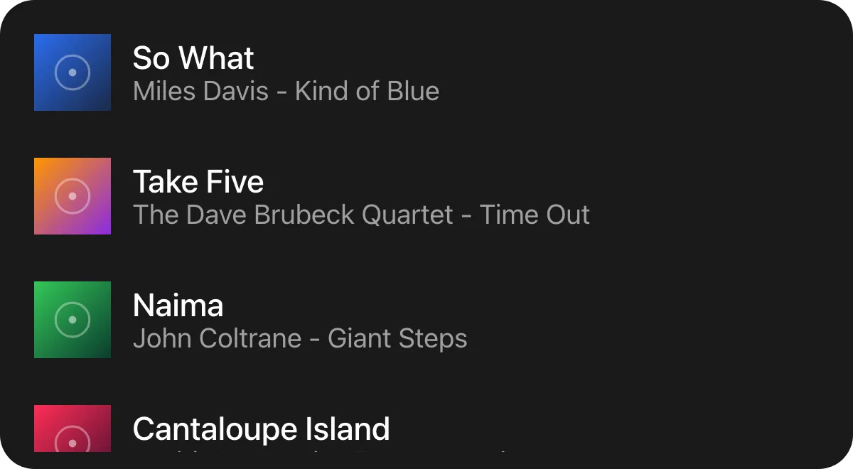
A windowed result list, adapted from the built-in music picker: it starts with a few rows and grows as the user scrolls.
Loading more items
Section titled “Loading more items”void OnRevealed(UiEventData data){ if (!data.TryGetDouble(out var index)) return;
var wanted = (int)index + 25; if (wanted > window.Value) window.Value = wanted;}reveal carries the index of the furthest child the user has brought into view. Append children, or do
not; there are no page sizes and no “has more” flag. When you run out, append nothing - the reader asks
again only once the user goes further than before.
Keeping rows stable
Section titled “Keeping rows stable”KeySelector = item => item.Id,Key rows by the item’s own id, never its position. Rows are patched in place as the list grows or a filter narrows it, and a positional key would re-key everything below the change.
Showing an empty or loading state
Section titled “Showing an empty or loading state”new UiWhen{ Key = "emptyWhen", Condition = () => items.Value.Count == 0, Content = () => new UiTextRun { Key = "empty", Text = "Nothing found", Role = UiComponentTextRoles.Secondary },},“Loading” and “empty” are your own state, so express them as ordinary children of the list rather than properties.
Scrolling horizontally
Section titled “Scrolling horizontally”new UiList{ Key = "covers", Direction = UiComponentDirections.Horizontal, RequiredComponentVersion = 2, Fallback = new UiStack { Key = "coversFallback", Children = [firstCover] }, Children = covers,}Horizontal needs component version 2. A version 1 reader ignores direction and scrolls vertically,
so ask for version 2 and carry a ui.stack fallback.
Properties
Section titled “Properties”| Property | Values | Default | Meaning |
|---|---|---|---|
Direction (direction) |
UiComponentDirections.Vertical, .Horizontal (vertical, horizontal) |
vertical |
The scroll axis; horizontal needs component version 2. |
Gap (gap) |
length | No gap | The gap between children. |
Padding (padding) |
length | No padding | Inner padding on every edge. |
Background (background) |
#rrggbb |
Paints nothing behind its children | The list’s own fill, a literal colour like every container fill - see Colours and text. |
MainSize (mainSize), Fill (fill), Answer (answer) |
- | - | Shared with every container - see Stack and layer. |
Events
Section titled “Events”Declared only where Events names it - see Events.
| Event | When | Payload |
|---|---|---|
UiComponentEvents.Reveal (reveal) |
The user has reached the end of what the list currently holds | The index of the furthest child brought into view, as a bare number |
Children
Section titled “Children”Any element, any number, one after another along the scroll axis.
Layout
Section titled “Layout”The main axis - y for a vertical list, x for a horizontal one - is unbounded: children take their
natural extent along it, and their mainSize/fill are ignored on that axis. Across it, each child takes
the list’s inner extent. On its own parent’s main axis a list follows the ordinary container rule:
mainSize or fill if declared, otherwise its content extent. See Sizing.
Reader behaviour
Section titled “Reader behaviour”- Send
revealonly if the node declares it. - Send at most two
revealevents a second, and only for an index beyond the furthest one already sent for the same list. - The payload is a child index, not a page; never assume a page size.
- A version 1 reader ignores
directionand scrolls vertically - negotiation catches unknown types, not unknown values, so producers pairhorizontalwith version 2 and a fallback. - Ignore children’s
mainSizeandfillon the scroll axis.
See also
Section titled “See also”- Stack and layer
- Text field - the other dialog-only element
- Events
- Sizing