Range bar
A read-only track carrying one gradient-filled span, with an optional marker for a point inside it - a forecast’s low-to-high span, a level meter, a position on a fixed scale.
ui.range-bar
Example
Section titled “Example”new UiRangeBar{ Key = "bar", Fill = true, Thickness = UiSize.FromBasis(0.03, 0.35), Start = 0.2, End = 0.6, StartColor = "#2b6cee", EndColor = "#ee2b2b", Marker = UiValue.From(() => state.Value.TodayFraction),}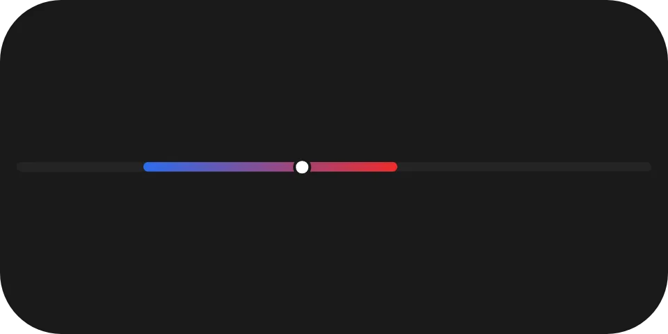
A forecast row: a blue-to-red span from 20 % to 60 % of the track, with today’s temperature marked on it.
Point marker
Section titled “Point marker”Marker = isToday ? UiValue.From(() => state.Value.TodayFraction) : UiValue.None<double>(),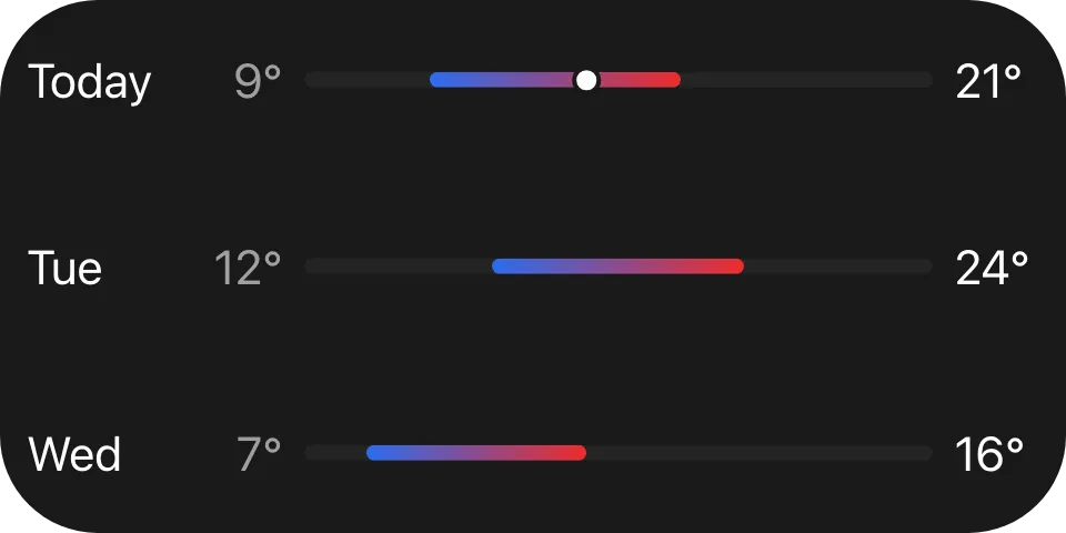
Leave Marker absent and no marker is drawn. The marker is painted in the reader’s text colour, not the
gradient, so it stays visible wherever it lands.
Colours
Section titled “Colours”StartColor and EndColor are literal colours, not theme roles: they encode data, so a value must look the
same in every theme - see Colours and text. Use the same colour twice for a solid
span.
Properties
Section titled “Properties”| Property | Values | Default (absent) | Meaning |
|---|---|---|---|
Start (start) |
0..1 |
- | Where the filled span begins, as a fraction of the track. |
End (end) |
0..1 |
- | Where the filled span ends, as a fraction of the track. |
StartColor (startColor) |
#rrggbb |
- | The colour at start. |
EndColor (endColor) |
#rrggbb |
- | The colour at end. |
Marker (marker) |
0..1 |
No marker is drawn | Where the point marker sits, as a fraction of the track. |
Thickness (thickness) |
length | Left to the reader | The track’s thickness on the cross axis. |
Events
Section titled “Events”None. ui.range-bar is never interactive - use ui.slider for the same shape
the user can drag.
Children
Section titled “Children”None. ui.range-bar is a leaf.
Layout
Section titled “Layout”The track spans the element’s full main-axis extent and is thickness tall on the cross axis. The element
follows the ordinary leaf rule on its parent’s main axis - MainSize or Fill if declared, otherwise its
content extent. See Sizing.
Reader behaviour
Section titled “Reader behaviour”The geometry is normative; the fixtures in ui-model/fixtures/component-profile/ resolve it at two sizes.
- The track is centred on the cross axis with fully rounded ends; the unfilled track uses the reader’s tertiary surface colour.
- The filled span runs from
starttoendwith a linear gradient fromstartColortoendColoralong the main axis, and keeps fully rounded ends even when it stops short of the track’s ends. - The marker is a filled disc of radius
0.75 * thicknessin the reader’s primary text colour, ringed by a stroke of width0.28 * thicknessin the widget’s own background colour. - The marker’s centre is inset from both ends by
radius + strokeWidth / 2; when the track is narrower than twice that inset, the marker is centred instead.