Slider
A draggable level: a rounded track carrying a filled span. It holds a fraction of the track in 0..1,
not a value in your own units.
ui.slider
Example
Section titled “Example”new UiSlider{ Key = "volume", Fill = true, Level = UiValue.From(() => state.Value.Volume / 100.0), Step = 0.05, Thickness = UiSize.FromBasis(0.12, 0.55), Events = [ UiEventHandler.On(UiComponentEvents.Adjust, data => Preview(data)), UiEventHandler.On(UiComponentEvents.Change, data => Apply(data)), ],}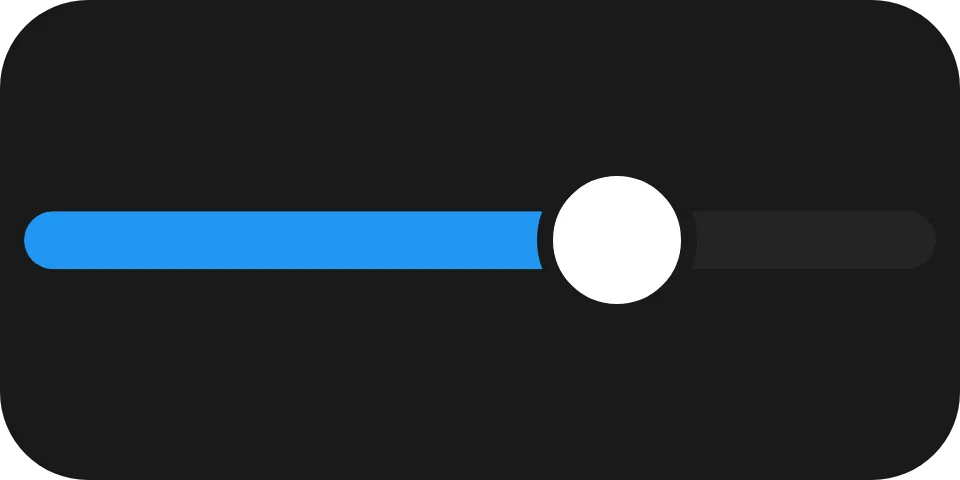
A horizontal volume track snapping to 5 % steps: adjust moves the display while dragging, change
commits the level the user landed on.
Reading the level
Section titled “Reading the level”UiEventOutcome Apply(UiEventData data){ if (!data.TryGetDouble(out var level)) { return UiEventOutcome.Rejected("The event payload is not a number."); }
state.Set(state.Value with { Volume = level * 100 }); return UiEventOutcome.Accepted;}Both events carry the level as a bare number. Convert it to your own units yourself; a number beside the
slider is an ordinary ui.text you update.
Adjust or change
Section titled “Adjust or change”Act on change alone for anything costly, such as a seek, and let adjust just move the level. Acting on
every adjust would drag the target through every waypoint; ignoring both would leave a control that does
not move.
Vertical slider
Section titled “Vertical slider”Direction = UiComponentDirections.Vertical,
Direction is the axis the level travels along, not the element’s axis in its parent. Vertical runs
bottom to top - up is more.
Colour and fallback
Section titled “Colour and fallback”LevelColor = "#2b6cee",Fallback = new UiRangeBar { Key = "trackFallback", Start = 0, End = level, StartColor = "#2b6cee", EndColor = "#2b6cee" },A reader without ui.slider draws the fallback, here the same level as a read-only range bar.
Properties
Section titled “Properties”| Property | Values | Default (absent) | Meaning |
|---|---|---|---|
Level (level) |
0..1 |
0 |
The filled fraction of the track. |
Step (step) |
fraction of the track | Continuous | The granularity the level snaps to. |
LevelColor (levelColor) |
#rrggbb |
The reader’s own accent colour | The filled span’s colour. |
Direction (direction) |
horizontal, vertical |
horizontal - unlike ui.stack |
The axis the level travels along. |
Thickness (thickness) |
length | Left to the reader | The drawn track’s thickness on the cross axis. |
LevelColor is a literal colour, not a theme role - see Colours and text.
Events
Section titled “Events”| Event | Fires when | Payload |
|---|---|---|
adjust (UiComponentEvents.Adjust) |
An intermediate level while the user is still working the control | The level, a bare number |
change (UiComponentEvents.Change) |
The interaction ended, sent once | The level, a bare number |
double-press (UiComponentEvents.DoublePress) |
A second tap completed shortly after the first, neither one a drag | None |
Declare double-press for an action on a double tap, such as resetting to a home level. Each tap is still an
ordinary interaction and sends its own change first, so the handler sees the level the second tap set and
replaces it. A reader that predates double-press never sends it, and the taps stay plain level changes.
Children
Section titled “Children”None. ui.slider is a leaf.
Layout
Section titled “Layout”The element’s whole box is the interactive surface; the drawn track is smaller. Thickness sizes only the
drawn track, not the element. On its parent’s main axis the slider follows the ordinary rule - MainSize
or Fill if declared, otherwise its content extent. See Sizing.
Reader behaviour
Section titled “Reader behaviour”- Interaction only where declared. A node with no events carries no
eventsproperty and is drawn as a level the user cannot touch; there is no disabled property. - The whole box takes input. A pointer anywhere in it sets the level to its position projected onto
direction, clamped to0..1; the cross-axis position is ignored. A pointer that leaves the box mid-drag keeps control until release. - Snapping: with
steppresent, the level becomesround(level / step) * step, clamped to0..1, before it is painted or sent. A tie rounds up. - Paint locally first: the reader paints the level it computed straight away and reconciles with the producer afterwards.
- Rate and order:
adjustat most ten times a second, never after thechangethat ended the interaction. Only declared names are sent. - Double tap: with
double-pressdeclared, a tap released within 400 ms of the previous one and starting within 24 px of it, neither moving more than a few pixels, sendsdouble-pressright after itschange. A drag or a cancelled gesture in between starts over. - Geometry is normative: the track and thumb are implemented exactly; the fixtures in
ui-model/fixtures/component-profile/resolve both at two sizes.