
Segmented
A row of equal segments with one selected - a mode switch, a scene picker. Each child is one segment’s content; the control, not the children, receives the press.
ui.segmented
Example
Section titled “Example”new UiSegmented{ Key = "mode", Selected = UiValue.From(() => (int)state.Value.Mode), Events = [UiEventHandler.On(UiComponentEvents.Change, data => SetMode(data))], Children = [ new UiIcon { Key = "sun", Icon = UiIcons.Sun, Size = 0.14 }, new UiIcon { Key = "moon", Icon = UiIcons.Moon, Size = 0.14 }, new UiTextRun { Key = "auto", Text = "Auto", Size = 0.1 }, ], Fallback = new UiStack { Key = "modeFallback", Direction = UiComponentDirections.Horizontal, Children = modeButtons },}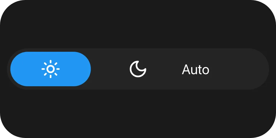
Reading the index
Section titled “Reading the index”UiEventOutcome SetMode(UiEventData data){ if (!data.TryGetDouble(out var index)) { return UiEventOutcome.Rejected("The event payload is not a number."); }
state.Set(state.Value with { Mode = (Mode)(int)index }); return UiEventOutcome.Accepted;}change carries the zero-based index of the segment the user chose, as a JSON number. Set Selected from
it.
Holding the selection
Section titled “Holding the selection”A completed press on a segment other than the drawn selection moves the face there at once and sends
change. The reader holds that selection until your Selected changes or one second passes, as a
toggle holds its state. A press on the segment already selected sends nothing.
Children are content
Section titled “Children are content”The children are drawn, never pressed. A button or slider inside a segment is painted but offers none of its events, and the deck never treats one as the tile’s control.
Properties
Section titled “Properties”| Property | Values | Default (absent) | Meaning |
|---|---|---|---|
Selected (selected) |
int, zero-based |
No face drawn | The selected segment. Out of range also draws no face. |
LevelColor (levelColor) |
#rrggbb |
The reader’s own accent colour | The selected face’s colour. |
MainSize (mainSize), Fill (fill), Answer (answer) |
- | - | Shared with every container - see Stack and layer. |
Events
Section titled “Events”| Event | Fires when | Payload |
|---|---|---|
change (UiComponentEvents.Change) |
A press completed on a segment other than the selected one | The segment’s zero-based index, a JSON number |
Children
Section titled “Children”Any element, any number; one segment per child. Their own events are never offered.
Layout
Section titled “Layout”The width is divided into one equal segment per child, in a row, and each child is laid out over its
segment’s box. The element’s whole box is the press surface. On its parent’s main axis a segmented control
has no content extent: give it MainSize or Fill. See Sizing.
Reader behaviour
Section titled “Reader behaviour”- Geometry: a capsule track over the whole box in the tertiary surface colour; the selected segment’s
face is a capsule inset by
0.08of the box height, inlevelColoror the accent colour. - Interaction only where declared. Without
changethe control is drawn and cannot be touched. - The pointer picks the segment from its position; children never receive it, and their declared events are never sent.
- Press feedback: with
changedeclared, the reader paints its press tint on touch. The deck tile’s own pressed state follows the control only when it is the root of the tree, as for a button. - A completed press on a segment other than the drawn selection selects it, sends
changeonce with its index, and holds it untilselectedchanges or 1000 ms pass. A cancelled press sends nothing. - Keyboard and hardware: in the Macro Deck desktop app, activating a tile whose first interactive node is a segmented control selects the next segment, wrapping to the first after the last; with nothing selected it selects the first. The web client does not activate tree nodes from the keyboard.
- Activation acts on the producer’s value: it steps from the
selectedthe tree last carried, not a selection the reader is still holding after a tap, and the face moves when the producer answers. - A reader that does not know
ui.segmenteddraws the node’sfallback, typically aui.stackofui.button:
{ "type": "ui.segmented", "properties": { "selected": 0, "events": ["change"] }, "children": [ { "type": "ui.text", "properties": { "text": "Day" } }, { "type": "ui.text", "properties": { "text": "Night" } } ], "fallback": { "type": "ui.stack", "properties": { "direction": "horizontal" }, "children": [ { "type": "ui.button", "properties": { "events": ["press"], "fill": true }, "children": [{ "type": "ui.text", "properties": { "text": "Day" } }] }, { "type": "ui.button", "properties": { "events": ["press"], "fill": true }, "children": [{ "type": "ui.text", "properties": { "text": "Night" } }] } ] }}