
Stack and layer
A stack lays its children out along one axis. A layer draws every child across the whole box, the first one furthest back.
ui.stack / ui.layer
Example
Section titled “Example”new UiStack{ Key = "row", Direction = UiComponentDirections.Horizontal, Align = UiComponentAlignments.Center, Gap = UiSize.FromBasis(0.025), Padding = UiSize.FromBasis(0.02), Children = [ new UiImage { Key = "art", Source = cover, Size = UiSize.FromBasis(0.09) }, new UiStack { Key = "labels", Fill = true, Justify = UiComponentJustify.Center, Gap = UiSize.FromBasis(0.004), Children = [ new UiTextRun { Key = "title", Text = item.Title, Size = UiSize.FromBasis(0.038), Weight = UiComponentTextWeights.Medium }, new UiTextRun { Key = "subtitle", Text = item.Subtitle, Size = UiSize.FromBasis(0.032), Role = UiComponentTextRoles.Secondary }, ], }, ],}
A track row from the built-in music picker: cover art on the left, two lines of text filling the rest.
A row with one filling child
Section titled “A row with one filling child”new UiStack{ Key = "header", Direction = UiComponentDirections.Horizontal, Children = [ new UiTextRun { Key = "name", Text = "Office", Size = 0.12, Fill = true }, new UiTextRun { Key = "temp", Text = "21°", Size = 0.12, MainSize = 0.3, Align = UiComponentAlignments.End }, ],}+--------------------------+--------+| Office | 21° |+--------------------------+--------+
Fill takes whatever the siblings leave. A text next to a filling sibling needs its own MainSize, because
a reader cannot measure text without a font - see Sizing.
Spreading children apart
Section titled “Spreading children apart”new UiStack{ Key = "current", Direction = UiComponentDirections.Horizontal, Justify = UiComponentJustify.SpaceBetween, Align = UiComponentAlignments.Center, Children = [icon, temperature],}+-----------------------------------+| [icon] 21° |+-----------------------------------+
SpaceBetween puts all free space between children and none at the edges.
Lining up a value and its unit
Section titled “Lining up a value and its unit”new UiStack{ Key = "reading", Direction = UiComponentDirections.Horizontal, Align = UiComponentAlignments.Baseline, Children = [ new UiTextRun { Key = "value", Text = "73", Size = 0.3 }, new UiTextRun { Key = "unit", Text = "km/h", Size = 0.1 }, ],}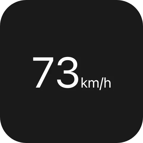
Baseline puts the runs’ text on one line instead of aligning their boxes. Only children that draw text
take part; anything else in the row aligns to the trailing edge.
Spacing without margins
Section titled “Spacing without margins”new UiStack{ Key = "card", Padding = UiSize.FromBasis(0.06), Gap = UiSize.FromBasis(0.03), Children = [title, new UiStack { Key = "inset", Padding = 0.04, Children = [body] }],}No element has a margin property. Space around one child comes from wrapping it in its own stack with
Padding.
Drawing one element behind another
Section titled “Drawing one element behind another”new UiLayer{ Key = "historyGraph", Children = [ new UiChart { Key = "chart", Points = points, PlotTop = 0.66 }, new UiStack { Key = "labels", Padding = safeArea, Children = [title, subtitle] }, value, ], Fallback = value,}+----------------------+| CPU <- labels| 42 % <- value| /\_/\__/\ <- chart (furthest back)+----------------------+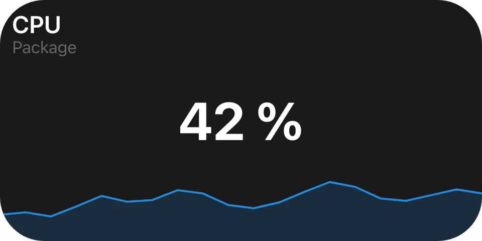
The built-in history graph: a chart edge to edge, labels inset over it. Each layer child that needs
padding, gap, justify or align wraps itself in a ui.stack, which also lets two layers inset differently.
Fallback gives an older reader the value alone.
Properties
Section titled “Properties”ui.stack
Section titled “ui.stack”| Property | Values | Default | Meaning |
|---|---|---|---|
Direction (direction) |
UiComponentDirections.Vertical, .Horizontal (vertical, horizontal) |
vertical |
The layout axis. |
Justify (justify) |
UiComponentJustify.Start, .Center, .End, .SpaceBetween (start, center, end, space-between) |
start |
How free space is distributed along the main axis. |
Align (align) |
UiComponentAlignments.Start, .Center, .End, .Stretch, .Baseline (start, center, end, stretch, baseline) |
stretch |
How children are aligned on the cross axis. |
Gap (gap) |
length | No gap | The gap between children. |
Padding (padding) |
length | No padding | Inner padding on every edge. |
Background (background) |
#rrggbb |
Paints nothing behind its children | The stack’s own fill, a literal colour rather than a theme role - see Colours and text. |
ui.layer
Section titled “ui.layer”No properties of its own: no padding, gap, justify, align or background.
Shared with every container
Section titled “Shared with every container”| Property | Values | Default | Meaning |
|---|---|---|---|
MainSize (mainSize) |
length | Measured from content | The extent on the parent’s main axis - see Sizing. |
Fill (fill) |
bool |
Does not fill | Takes the parent’s leftover main-axis space - see Sizing. |
Answer (answer) |
string | No answer | On a dialog surface, the value a press inside it settles the dialog with - see Events. |
Events
Section titled “Events”None of their own. Either can still complete a dialog through Answer when a descendant’s press claims
it: the affordance belongs to the declared event, not the node type, so a list row can be a stack (no
accent background) and still settle the dialog.
Children
Section titled “Children”Both: any element, any number, in any combination.
Layout
Section titled “Layout”A stack divides its own main-axis extent among its children: each child’s mainSize or fill competes
for that budget, and a child declaring neither is measured from what a renderer can work out without a font.
A text needs its own mainSize whenever a filling sibling sits next to it.
A layer gives every child the whole content box, in declaration order, first one furthest back.
mainSize and fill mean nothing on a layer’s children, because there is no axis to divide.
See Sizing for the full model.
Reader behaviour
Section titled “Reader behaviour”- A stack with no
directionlays out vertically, nojustifymeansstart, noalignmeansstretch. baselineapplies to children that draw text; other children in the row align to the trailing edge.- A stack with no
backgroundpaints nothing behind its children; a layer never paints a background. - On a layer, ignore
mainSizeandfillon children; every child gets the whole box. - A reader that does not know
ui.layerdraws the node’sfallback- it is a type, not a thirddirection, so negotiation catches it.
See also
Section titled “See also”- Sizing
- Events
- Colours and text
- Transform - a layer that also rotates, scales and shifts
- List - a scrolling container for dialogs